LA Railstats Web Application Design

Overview
The LA Metro, Los Angeles County’s largest public transportation system agency, has a publicly accessible API that gives access to the positions of Metro vehicles in real time. LA Railstats is a web application that uses this API to track LA Metro trains and generate punctuality reports, enabling both Metro officials and the public to easily review up-to-date statistics for LA's 6 train lines.
The problem
The LA Metro did not have any way to quickly, easily and intuitively present data from their API. At Hack for LA, a volunteer civic tech collective, the LA Railstats team of developers and Product Managers (in an advisory capacity) had been working on addressing this problem. I joined the project as a UX designer, along with a UX design lead, to bring in our UX skill set and improve on the UX of the web application the LA Railstats team was looking to build.
Role
UX designer, alongside a core team also consisting of a UX design lead and software developer lead
Tools
Pen & paper, sticky notes, Google Forms, Balsamiq, Figma
Duration
3 months
Discovery
Assessing the work so far
At the time that I and the design lead joined the project, the development team was in the middle of building out the first iteration of a webpage to visually display LA Metro Rail punctuality reports. Their plan was to showcase the information by plotting the data on Marey diagrams.
This is an example of what a Marey diagram looks like:

Credit: Visualizing MBTA Data
We saw that, and quickly judged that it was not an intuitive, easily digestible way to be displaying punctuality reports to potential users.
To refine the design direction of the LA Railstats web application, we knew the best way was to go back to exploring the problem space and making design decisions informed by user research.
Stepping back: exploring the problem space
We decided to kick off our UX work by interviewing LA Metro Rail riders to have a better understanding of their experience with the LA Metro Rail, and perception of its timeliness.
Through brainstorming sessions, we defined the questions we were looking to uncover via the user interviews, and put together the user interview questions.

In tandem with that, we sent out a Google Forms interview screener online, in order to recruit LA Metro Rail riders that would be willing to share their experiences with us.
Interview screener screenshot
We conducted phone interviews of 10 LA Metro Rail riders. The design lead and developer lead were also able to meet with an LA Metro employee, and interviewed them. The aim of this interview was to get a better sense of their work and how the data the LA Metro API provides could potentially serve their organization.
User research insights, persona-fied
Based on the insights collected from the interviews, we came up with four different personas on the different types of people that interact with the LA Metro Rail. The interview data directly informed the needs, goals and pain points these personas list out.

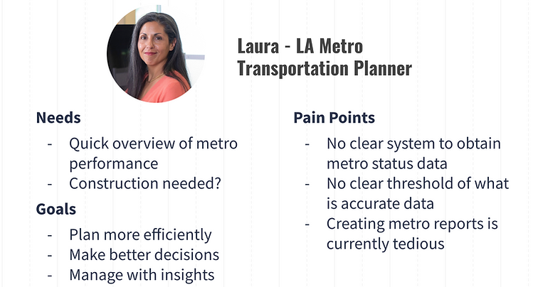
Two of the four personas
Unfortunately, due to internal restructuring that LA Metro was undergoing right around this time, our access to further employees was in limbo, and we had to use this limited sample of data to build out a hypothetical persona for the LA Metro employees we envisioned could use LA Railstats - transportation planners and other LA Metro employees in charge of deciding how the LA Metro Rail system runs, and how resources get allocated to its six rail lines.
Ideation
Brainstorming solutions
Guided by our user research insights we distilled into personas, we went through an affinity mapping exercise together to brainstorm potential solutions for each of those, based on their pain points and goals.


Affinity mapping exercise photos
Based on the fact that Google Maps and other similar products already target riders, we ultimately chose to focus on the transportation planner/LA Metro employee user audience. This was a user audience for where there were limited apps and/or services currently targeting their particular pain points and goals.
Wireframing ideas
Having decided on the transportation planner/LA Metro employee user audience, we created low-fidelity wireframes of the potential solutions to quickly flesh out our ideas; I created mine in Balsamiq. These wireframes were based on the user pain points and goals that we’d surfaced in the LA Metro employee/transportation planner persona.

Wireframe concept 1

Wireframe concept 2
Painting use cases
We did storyboarding to help us explore how people would use the potential solutions we were working on. Our goal in storyboarding was to explore these scenarios visually, and paint more context on our personas and the problems they are trying to solve.

Storyboard example #1

Storyboard example #2
Iterating on initial concepts
With our storyboards helping us evaluate our initial wireframes further, the design lead and I discussed which ideas we thought would best address our users’ pain points and goals. We then moved those forward by iterating on those with a second round of wireframing in Figma.


Wireframes v2, example 2
Wireframes v2, example 1
Logo Design
Request for a logo
Around this time, the dev lead asked us if we could design a logo for LA Railstats logo to use on the web application they were building. They also had a request for variations on the logo, for train-specific highlights. I designed the LA Railstats logo and its variants - we wanted to have a simplified logo illustrating the LA Metro Rail lines that could also serve as a launch point for future project branding.

Color palette, logo and logo variants design
Usability Testing
What do users think?
Our initial goal was to conduct usability tests with LA Metro transportation planners and/or other Metro employees for whom LA Metro Rail punctuality report data is directly useful to their roles. We had to pivot and conduct usability tests with Hack for LA members, as a number of them are frequent LA Metro riders to meetups. We also chose to include the LA Railstats page the developer team had previously built, to obtain user feedback we could use to back our design feedback we’d be giving the developer team.
We recruited six people for usability testing. There were some great pieces of feedback that emerged from our usability testing:
There was confusion around the wording for “on time” - what is the minimum timeframe a train must meet to be on time exactly?
As we had initially hypothesized, Marey diagrams were not something users were familiar with, and they were confused as to what they were looking at.
We had other data cards displaying, but users pointed out they were redundant - the first two cards already basically gave the most important data in their eyes.
Implementation
Handing off to the developer team
With the usability testing completed, we shared our takeaways and wireframes with the lead developer. We discussed how the wireframes and usability testing insights had informed us on the best way to redesign the LA Railstats web application to more intuitively visually depict the punctuality report data for users to consume.
We were able to collaboratively arrive at an MVP direction with prioritized features, based on what the usability testing insights and the bandwidth the dev team had. Convinced by the user research we shared, the dev team worked on implementing the changes we had outlined for them.


Mobile UI
Desktop UI
Outcomes & Lessons Learned
The LA Railstats team was able to get in touch with LA Metro employees again and present our redesigned LA Railstats web app to them. Unfortunately, due to my work schedule, I was unable to personally attend this meeting. The LA Metro employees showed interest in the tool and began using it to inform their work and meetings (see persona point about how it was time-consuming for them to generate quick reports with their tools).
The live site for our project can be found at https://la.railstats.org/
The ideal next step would be to iterate further on the MVP, based on the use that LA Metro employees continue to find for it, and any further data visualization they might need. Further on down the line, it would be exciting to scale this project to cover all trains and buses in the LA Metro system. We chose to pilot this MVP with the six main LA Metro Rail lines, as it would be easier to design and develop for a smaller number before scaling the LA Railstats application in the future.
Looking back at the project, it would have been great if we had been able to talk to internal LA Metro Rail employees more, and conduct usability tests with them. This was difficult due to internal restructuring that was going on with the LA Metro organization at. the time of this project. That could have given us a better insight into how LA Railstats could better serve their work. On the flip side of the coin, interviewing and usability testing with people that frequently ride the LA Metro - showed how you can still gain valuable insights from secondary audiences that interact with a product or service that you’re designing for.
On a more visual design-related note, I would have liked to workshop the logo design with the rest of the team, in order to further iterate on an improved version of the LA Railstats logo. Logo design is not something I do very often, so I took it as a challenge to grow, and I’d say my reflection on next steps to take with logo design next time is a sign of growth.