Bluebeam Download Center:
Update Experience Case Study

The problem
Bluebeam, Inc. offers collaborative PDF solutions for the Architecture, Engineering, and Construction (AEC) industry, such as its flagship product, Revu. Download options for the software are available through our Download Center page. The update experience through this page, however, was causing confusion for users. In order to provide a seamless customer experience around updating Revu software from the Download Center page, some changes were required.
Role
UX Researcher & Designer
Tools
Sketch
Discovery
Initial findings
Through phone and email conversations with various customers reaching out to Bluebeam Technical Support, I became aware that the download button for the Revu 2019 update, which at the time stated Upgrade to 2019.0.20, was setting wrong expectations for users on older Revu applications (Revu 2018 or below):

The download was actually for a patch installer that only worked with existing Revu 2019 installations, not older Revu applications. When the customers would go to run the patch installer on their older versions, they’d run into installation errors.
By looking through the analytics reporting on Bluebeam Technical Support phone and email cases, I found out this was leading to anywhere from 5-10 new cases a week in phone and email traffic to Technical Support and other customer-facing teams, with customers frustrated over the negatively perceived upgrade experience.
Customer quotes:
-
“The button mentioned the word “upgrade” - but no such thing happened. Is the upgrade process broken? Is this a bug?”
-
“Our IT admin just uninstalled the older Revu software and was intending to upgrade our software. Clicking the Upgrade button on your downloads page did not do any upgrade… now we’re currently losing money and time because we’re unable to do our work without the product!”
Further digging
To further validate my discovery, I reached out to four technicians from the general and enterprise technical support teams. Every single one of them confirmed they’d also noticed the same issue, and had previously just chalked it up to user error. However, I knew that we needed to clarify that the update download buttons were specifically for those that already had the base installation of the major release version.
I compared the wording of the Revu 2019 update button against the download links to the older version patches. The wording for the older patch download links - Click here if you’re updating from 201x.x - made it unequivocally clear that a base installation was required, and that the link was just for an update:

Ideation
Brainstorming potential solutions
Having down the necessary discovery to understand the major pain point around the Download Center update experience, I began brainstorming potential solutions. The two most obvious ones boiled down to:
-
Updating the wording for the current 2019 update link button.
-
Getting rid of the button, and unifying the update download experience by instituting the same hyperlink format the Revu 2018 and below update links currently had.
I decided the best direction to take would be to modify the wording of the Revu 2019 update button, in order to keep the visual flow against the other existing buttons for downloading Revu 2019 installation packages. This would also be the least amount of reworking for the website content developer.
Prototyping
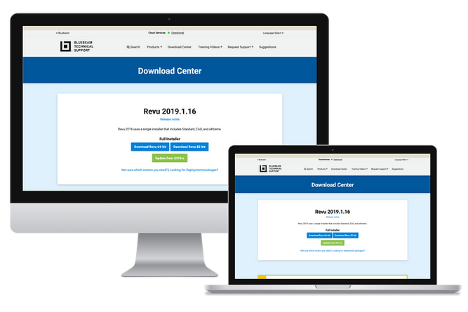
Using Sketch, I created a quick mockup of the Update button wording change I had in mind:

User Testing
Guerrilla user testing
Users that reach out to Bluebeam Technical Support are typically very busy, so asking for their time to run user testing directly with them wasn't the best idea. No matter - why not reach out to the people that interact and build empathy with the user on the daily: the Bluebeam technicians.
With the mockup I made in hand, I reached out to three technicians in the office, and did guerrilla user testing with them. I showed them the current site and mockup side-by-side, and asked them which one they believed should be on the live site, to make it clear what options were available on the Download Center’s Revu 2019 section.
All of them picked the mocked-up version. They mentioned the mockup’s wording for the update button clearly communicated that the update button was meant for systems already running an older Revu 2019 application.
Shipping the Fix
Pushing the validated solution live
Armed with the mockup and guerrilla user testing results, I reached out to the Documentation’s web development team. I let them know about the issue that I had noticed and validated with other technicians. I also presented the Sketch mockup I’d created, to help reinforce the simplicity of the change.
Since the current live site was leading to a pain point in the customer experience with the upgrade process, I proposed we push out the change as soon as possible, explaining we could continue to monitor customer traffic in the weeks to come and help us tweak further iterations if needed. The Documentation web development team agreed, and pushed out the change I had proposed to the live production site located here.
Results
The result: customer traffic around the update button drastically dropped. Two weeks after the change was enacted, I checked on the email and phone analytics reporting and within internal technical support Slack channels to see how many new cases we still had coming in around this.
The new cases were now just one around every 2-3 weeks, on average - a positive improvement from the 5-10 average cases a week!
Digging into the case notes for those for those few continuing edge cases helped understand their cause. The lingering ones ended up being customers that were rushing through a crisis or deadline on their end, and accidentally followed the wrong update path as a result of that. Overall, the change was a measurable success in preventing further impact around the customer update experience.
Before:
~5-10 cases a week
After:
~1 case every 2-3 weeks
Reflections
This project... was a valuable reminder that impactful UX doesn’t always come from large-scale radical redesigns.
Looking back on this project, I don’t believe it is typically ideal to push out changes on such short notice without more testing. In this situation, though, given my customer conversations and affirming feedback from other technicians, I believe it was necessary to push out the changes quickly, and iterate further if needed afterward.
It was a valuable reminder that impactful UX doesn’t always come from large-scale radical redesigns. In this case, one button’s wording was enough to have a large ripple effect on setting incorrect expectations and creating a negative user experience around updating vs upgrading. Depending on other factors going on at the user's end, the negative effect can vary widely.
Thankfully, through the discovery of the problem, quick ideation and testing, and collaboration with the web development team, my proposed solution was able to have a noticeable positive impact on the update experience through the Bluebeam Download Center.